In Memoriam – John Miles
John Miles, Wynkyn de Worde Society Chairman in 1974, has recently died, aged 92. Paul Harpin (Chairman, 2021) has written about him for us.
John Miles
11 February 1931 — 27 December 2023
This will be an obituary with a tinge of humour. John was that kind of man, a brilliant and thoughtful designer and boss, but great fun to be around and much loved by his clients. He was never a man to make friends to get business, rather someone who made lifelong friends of those he worked with, and for. Many clients were still friends at his death. John was, perhaps, a humanist… and a great friend to many, many Wynkyn de Worde Society members. We will all miss him.
The facts of John’s professional life are these: national service in North Africa, and then Beckenham Art School in 1952, also going to Maidstone Printers’ School for two days a week, which is where he first met Colin Banks, who was to be his business partner until Colin’s death in 2002. After being awarded a United Nations scholarship to study with Jan van Krimpen, Head of Design at Enschedé in Holland, John returned to England and did three years at Penguin books, working as assistant to Hans ‘half point’ Schmoller, so nicknamed because of his incredible fastidiousness. John duly learnt to be precise.
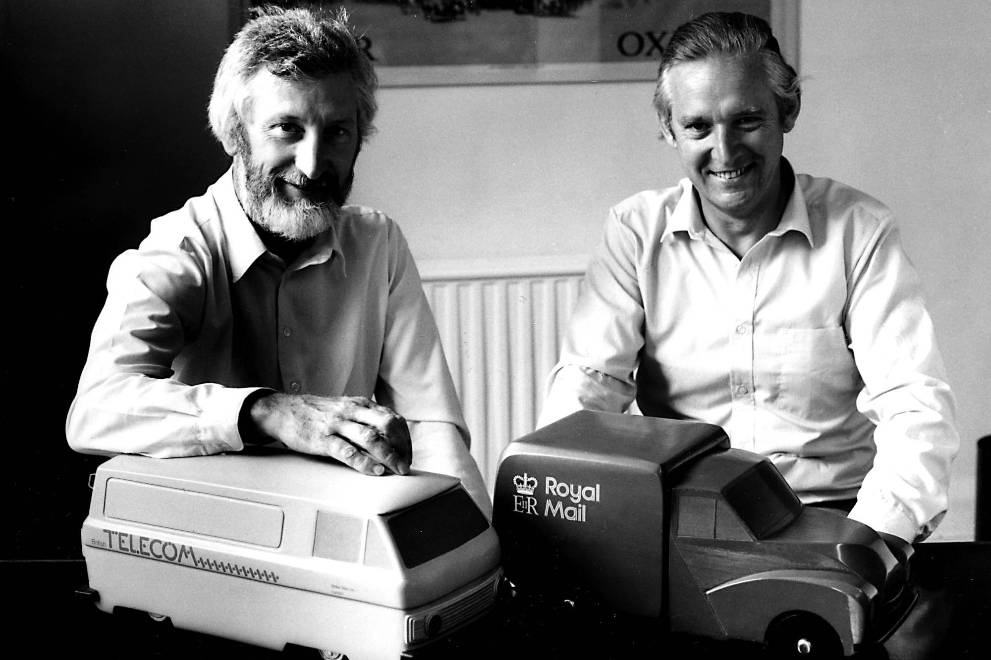
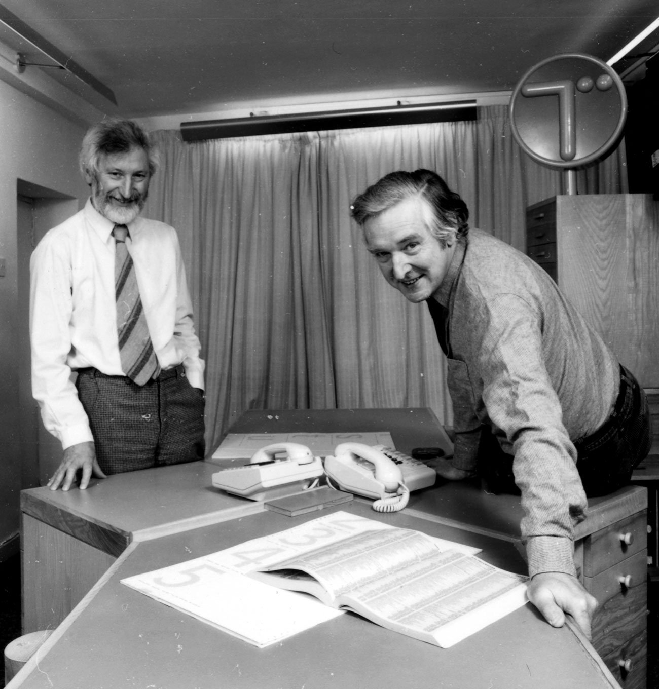
Colin and John started the design consultancy Banks & Miles in 1958, initially in a basement in Ebury Street, then later in Grafton Street, and finally in the former Literary Society building in Blackheath. Successful early work for London Zoo (a sign system for both Regent’s Park and Whipsnade) and the Consumers’ Association led to more prestigious projects, including corporate identities for the Post Office and British Telecom, which were won via paid pitches.
In 1979, they were asked to review London Transport’s publicity outputs, which led to the redrawing of the Johnston typeface to create New Johnston, unifying the advertising and publicity teams’ typography. Other notable Banks & Miles projects included a typographic restructuring of the telephone directories, which reduced the paper required from six volumes to one. Both these projects utilised the amazing typographic skills of one of their team, the type designer Eiichi Kono.
They kept clients for a long time, and clients loved them. London Zoo continued to ask the agency to visit every year, some 30 years after the work on its signs was completed. They won many awards.
But behind the man who co-created Banks & Miles lay a rich tapestry of experiences, influences and relationships, resulting in a lifelong love affair with print and typography. John learnt how to design at Beckenham Art School then how to print the designs at Maidstone, inspired by Oliver Simon’s Introduction to Typography and the college’s Albion Press. As a student, John was exposed to the work of Jan Tschichold, Jan Reiner and Piet Zwart and was most likely also influenced by the illustrative and ideas-based work of the Americans at Push Pin Studios (Milton Glaser and Seymour Chwast who were based in New York City), and the clever and witty work of Ben Shahn. Other influences were Wim Crouwel, El Lizzitsky and Herbert Spencer. Yet his skills were based also on the craft of print, and he must be one of the last people to have been taught the art of punch-cutting, which involves creating letters the same size to cast metal type, something more akin to the skills of a modern jeweller than a designer. There is a long-lost BBC film of John making a ‘smoke proof’, the method for checking how the punches he cut would print. It is believed that renowned type designer Matthew Carter was the last trained punch cutter in America, and that John was the last one in the UK.
As young men, Colin and John visited the Stedelijk Museum in Amsterdam together, and this tour of the graphic collection with Willem Sandberg was inspirational to the direction of their design. This was balanced by their interest, contacts with, and fascination for the multitude of English private presses, too. Which brought a more human touch to their early work. It was never cold.
Those who knew John might remember his serious side. “We took up typography because we thought we’d make the world a better place,” he told me. “There was a huge amount of idealism in the early 1950s. Colin was an idealist.” At the same time, though, he was empathetic and fun to be with, taking the trouble to speak to a young designer like myself in the pub, and describing his favourite meal of fish and chips and a glass of sherry on a Suffolk beach. He was a gentle man with a serious side and sense of humour and that made him a great boss, always down to earth, entertaining and helpful, but very witty with a light touch.
He would joke that their clients were often British, British everything: British Airports, British Telecom, British Council, British Rail, Pearson, Moulton bicycles, London Transport… the list went on. He was profoundly “English”, if that is a thing, but no little Englander, working for the EU long before the UK joined and decades later arguing passionately against leaving.
He believed that “type design was the holy grail of graphic design”, inspiring those around him to get on with the gruelling task. John drew the Royal Mail Double Line typeface, a masterpiece that is still in use for Royal Mail today. He also drew a single line version for text.
Patrick Britain, one of John’s Wynkyn de Worde friends observed: “There was nothing noisy about John, which made his humour all the greater. On a canal trip we took with fellow de Worders, I always felt a little ashamed each morning knowing that John had risen early, and was somewhere along the towpath painting, while myself and our fellow shipmates remained aboard to prime another bacchanalian day. Peter Guy and I took him to Lord’s to see the cricket — I was never sure about how much John cared for cricket, but we certainly enjoyed much laughter together with John that day.”
Banks & Miles were modernists, a fusion of English and Swiss perhaps, without sacrificing a respect for the past. But John had something else: ideas. Funny, charming, witty ideas. It was best seen in his work collaborating with the whole Banks & Miles studio, in the early days, to do covers for Which? magazine, published by the Consumers’ Association. They were subscription magazines, so instead of grabbing attention on the newsstand, the covers had to engage, be enjoyed and please. John and his gang came up with great cover ideas, such as a drawing of two bedsheet ghosts for the bedsheet test issue, or a crazy looking cartoon fly with a parachute on, floating down, for the fly killers test. The cover lines simply stated: ‘Bed sheets’ and ‘Fly spray’.
Inside the magazine was John’s mastery of information design, carefully crafted tabular information and clear text, to convey the huge array of consumer data with simple black and white technical drawings.
John said of his initial design “Typefaces were limited, there was Gill Sans, which I regarded as too humanistic and preferred to use Grot 215 and 216. Continental sans serifs such as Futura were available, but only for hand-setting. The arrival of Adrian Frutiger’s Univers, released in 1957, with its range of weights and sizes was a breath of fresh air. When the printers of Which?, the notable Shenval Press, acquired the typeface, John put it to good use straight away.
The B&M studio had around twenty people at its peak, and John was a talent spotter. Each of us was hand-picked to do specific jobs, but all had potential to help on whatever came in. Some left to have amazing careers, including Bruce Duckworth, who went on to form the hugely successful design consultancy Turner Duckworth, and Andy Davy, who became head of all the BBCs production operations. In the days before Adobe and the Apple Mac, they needed designers with great hand skills – they found Eiichi Kono at the Royal College of Art degree show, not to mention Alan Cheung, Peter Taylor and David Deadman.
John said: “One exception to this thorough process of recruitment was a very nice guy who worked for us, who literally came in off the street. He just turned up at the door with his portfolio: a guy called Darren looking for a job. It so happened we were terribly busy and there was a vacant desk and he was good. So I said, ‘Here you are, sit over there and get started.’ He stayed with us for five years.”
Alan Cheung, who spent a gruelling three years designing the huge BT yellow and blue identity and corporate design manual, was Hong Kong Chinese. He designed everything for British Telecom: vans, signs, shops, and even had to design a doormat for them, and he created a spoof one — it said ‘Welecom to Telecom’. Alan also showed me what happened when you rotated the new British Telecom T logo by 90 degrees three times. The symbol was a T partly formed by two circles. If you had that kind of mind it could look rather rude. Alan said: “When Telecom arrived at your home to mend your phone, firstly small cock-up, then big cock-up, and, after three hours — total balls up”.
All this fun was encouraged by John, as much to add to our work as lighten the atmosphere and, of course, he was happy to be on the receiving end as well. At one lunch, John was heard muttering “F*@§ING BEMBO” during discussions about text typefaces. It wasn’t that John disliked Bembo, he just thought it bit was over-used. So a photo of John, doctored in Photoshop wearing a F*@§ING BEMBO T-shirt, was duly distributed to the people who were on his table as a keepsake.
When John passed me to Colin after my first interview, I spotted that he had written on my CV upside down on Colin’s desk “great work, comes from good stable, a somewhat wily personality”. I think this was as much for me to see as Colin. They hired me, and I became less foxy and crafty. He was right.
My first assignment was to meet the editor of Gardening from Which? magazine. John said go to the Coal Hole public house on the Strand at 1pm, look for a man with brown hair, brown eyes, a brown shirt and tie, brown briefcase, brown coat and brown socks drinking brown ale. John knew full well that I’d have to somehow explain how I knew it was him, found him so easily in a packed pub, without giving the game away about John’s description.
Which? was a huge success, with a print run of more than two million copies a month and lots of spin-offs including The Good Pub Guide, The Good Food Guide, The Good Hotel Guide and The Good Skiing Guide. John’s friendship with the editor Dave Watts and the Good Skiing Guide editor Chris Gill led to him being invited to go skiing with them and they remained friends ever since. Ask them what it was like to be John’s client and they always give the same answer: “A lovely man”.
The Consumers’ Association board initially refused to describe John and Colin as “designers” because they thought that consumers would be put off by the cost of employing designers, so they were listed as “production editors”. Back then, the term graphic design was new and Banks & Miles had become one of only half a dozen such top consultancies in the UK.
John often organised office outings, including a memorable visit to see David Kindersley, who had carved our office sign and door number in his stone carving studio. Such a great day watching the carvers work.
There were many trips abroad, including Holland where John and Colin tried opening an Amsterdam office, and in the ’90s Banks & Miles also opened offices in Hamburg and Brussels. Colin did lecture tours further afield in Bulgaria and Hungary (it was difficult to get access there at the time) and they had connections to social and development projects in India.
John always returned from his visits with hilarious stories, including the time he was locked in for hours at security printers Enschedé, having accidentally set off the alarm. The big doors came down and no-one was allowed out for 24 hours.
Then there was the time when John had to manage the last bank note engraver left in Europe, a really ancient man who got a bit bored and eccentric in his dotage. John was overseeing the start of the banknote run, using a master banknote that all the colours balanced to. It was printed on a wider piece of paper to protect it and was covered by a flap. John opened it… to find that the old boy had written BOOO! on the master banknote itself!
Finally, John told of getting very stuck at UK Customs when officers discovered he was carrying printed sheets of uncut bank note proofs in a portfolio.
John’s early training and knowledge of print and printers resulted in many close friendships. John was an active member of the Wynkyn de Worde Society, serving as Chairman in 1974, and he was also a stalwart Double Crown Club member, serving as their dinner secretary for 30 years. Of course, he had design friends, too, including renowned designer Brian Webb who described John as a “blood relation” – not because of shared genes, but John's much-loved wire-haired Dachshund Daisy. “We never discussed design, just dogs,” he said.
When you were briefed by John, you’d be given an insight into the people. So he’d say, “Do remember that the Consumers’ Association chief executive Peter Goldman lost the Tories their biggest ever majority years ago, and really should be in the cabinet now. Don’t be scared of him, Paul, but he’s very direct.” Or he’d make sure I realised how busy the brilliant editor of Which? Dave Watts was, so I used my time with him carefully. He understood people and that helped our work.
Or when I did work for the Commission for Racial Equality he’d explain how it was run by fantastically well-meaning folk, but there were factions who fought, so when I presented, I should try to not be distracted and get our good work accepted.
One day I was in the studio and I heard a whirring noise up in Colin and John’s office — I went up to see John, and he was engraving a glass, as a gift for a Wynkyn de Worde Society guest speaker. The normal glass engraver was ill, and John had stepped in to save the day. That’s how I first heard about the Society, and realised John had such great hand skills. John was always ready to give credit to the design team and often told me how indebted he was to Alan Cheung, Eiicho Kono, Peter Stone, David Deadman and Peter Taylor, who were all as skilful as him.
John was no technophobe and, when desktop publishing arrived, he embraced it. In fact, he wrote a book about it, a brilliant guide for amateurs on how to structure pages and type using the new tools.
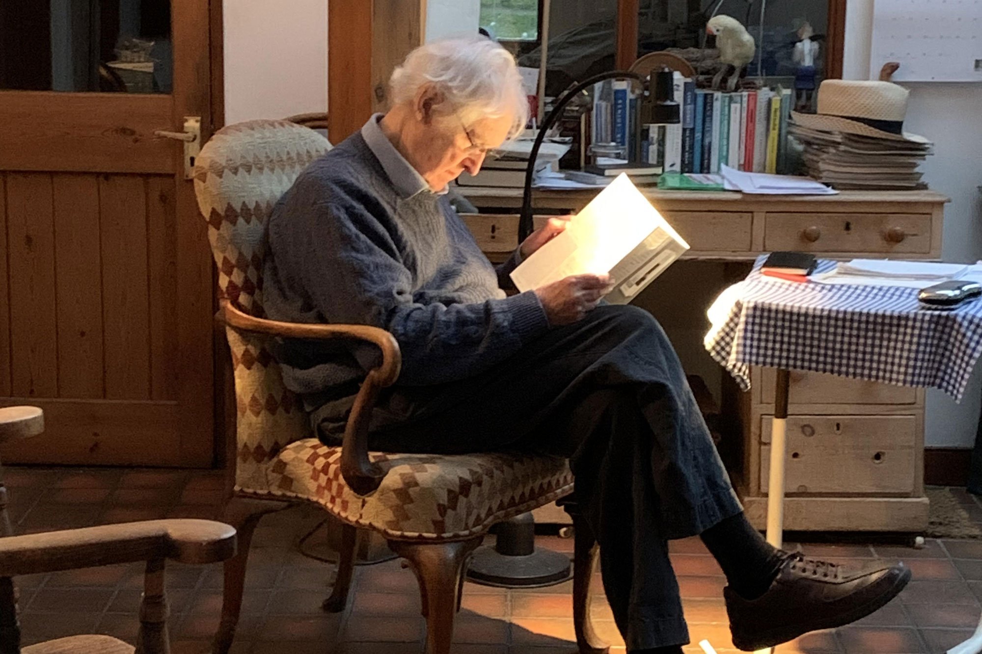
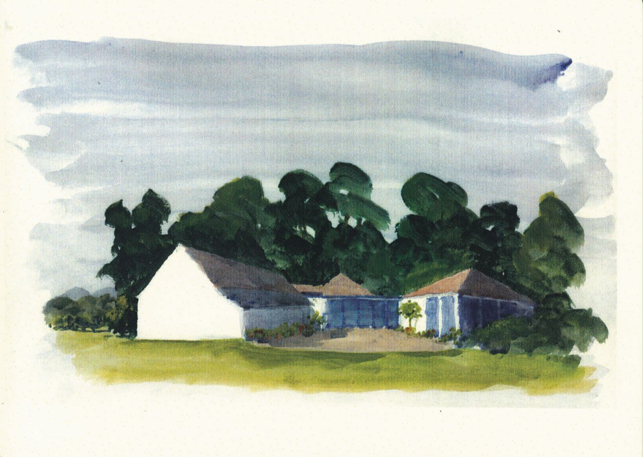
John, an accomplished artist, spent many days in his later life making fantastic watercolours and spiritual calligraphic art and typographic delicacies to amuse himself. The calligraphic/painterly works have a Chagall-esque mystery and illustrate the two Christian quotations ‘Seven golden candles’ and ‘Alpha and Omega’. But his daughter Sophia says, “Dad was not religious. He always said ‘the Bible is a bloody good read.’” The calligraphy of the biblical quotations is outstanding. His later-life watercolours and acrylics are masterful, too, depictions of his favourite, and much cherished Suffolk coastline around Felixstowe. Eiichi sent me John’s watercolour of his home in Suffolk to look at, too: it’s marvellous.
He had one regret and that was putting their own names on the business, Banks & Miles. He explained that clients always expected to meet either himself or Colin, which made them rather busy. Pentagram, by contrast, had done a clever thing to ensure that they had a name to sell and the freedom to take on new partners without disruption.
In their forthcoming book, Tony Pritchard and Ian McLaren pay tribute to John and Colin’s work, with a quote from John describing how “during the 60s and 70s, design became respectable and a desirable asset to commerce and industry”. Prichard and McLaren describe how Banks & Miles would work with clients to develop a design strategy, building mutual confidence, and enabling long-term working relationships to develop. John was “keen to refrain from the idea that Banks and Miles had an established ‘one size fits all’ house style that was applied irrespective of the client.”
Although Prichard and McLaren describe how Banks & Miles “became system thinkers associated with complex information design projects”, they also recall John’s modesty. “Whether we contributed to the themes of Modernism I really can’t say,” John is quoted as saying in the book. “We were inevitably influenced by it. We tried to push the boundaries where we could, and sometimes succeeded, particularly in the work we did for the Curwen Press, Imperial Machine Company and Enschedé in the Netherlands during the 1980s.”
John and Colin were jointly awarded the gold medal at the Brno Biennale in 1986 for the British Telecom identity. In 2017 John was awarded an HonFISTD by the International Society of Typographic Designers.
Colin’s wife Caroline remembers John as “the kindest, nicest man I ever had the good fortune to meet. At the time when Colin suggested to him that they might go into partnership, John had a well paid, secure job at Penguin, not to mention a wife and, I think, two children, so he took an enormous risk - it paid off! He was the jolly, fair-haired, clean shaven partner, Colin the dark bearded mysterious one. One anecdote, which I think came from John himself, was that in the early days, when few potential clients had heard of typography, Colin had to practise saying ‘our fee will be such and such’. John adored his wife and children – one day when the four of us had been invited to dinner somewhere (I forget where) we had arranged to meet up at Temple tube station, Louise was late, instead of being annoyed, John worried: ‘Oh poor Louise, she'll be in such a state’.
The final word has to go to John's daughter Sophia Mitchell. “Dad was a creative, imaginative designer and artist,” she says. “From the Post Office typeface and beautiful paintings, to birthday cards and cartoons. His drawings were a great pleasure to us as children, even when produced with golden syrup on our breakfast toast. His birthday cards are treasured possessions. He always took delight in doing things for us, which made them even more special. All his grandchildren gained so much from him, whether teaching them new skills or just playing in his beautiful garden. Dad had such patience and supportive words when we needed them. He had a huge capacity to listen and understand, even when things challenged his views.”
John is survived by his three children Catherine, Sophia and Jo and also his six grandchildren Alison, Lucy, Stan, Louis, Starsky and Maddie.
I owe my thanks to many people who collaborated with me on this obituary:
Simon Loxley for letting me see and use extracts from his two interviews with John, which will be used to make a Wynkyn de Worde Society keepsake about John, that will be available at a society luncheon;
James Alexander for allowing me to use extracts from Colin Banks obituary he wrote for The Guardian;
Ian McLaren and Tony Pritchard who have kindly given permission for extracts from their upcoming book Modernist Graphic Design in Britain 1945-1980 (due to be published in 2024 by The Modernist Society);
Paul Luna of Reading University (who hold the Banks & Miles archive) for pointing me to two interviews with John, conducted by former Reading student, Matthew Standage, for his dissertation on ‘The Post Office corporate identity 1965-1980’;
Dave Watts, former editor of Which? and his colleagues Alistair Aird, editor of the Good Pub Guide, and Helena Wiesner;
Alison Guy, Eiichi Kono, Sophia Miles, Caroline Banks, Alan Cheung, Judith Bastin, Peter Jones, Stuart Russell, Carol Kemp, Patrick Brittain and Patrick Fuller.