Spring and Summer talks at St Bride Foundation
There are a few enticing talks lined up for the next few months at St Bride Foundation:
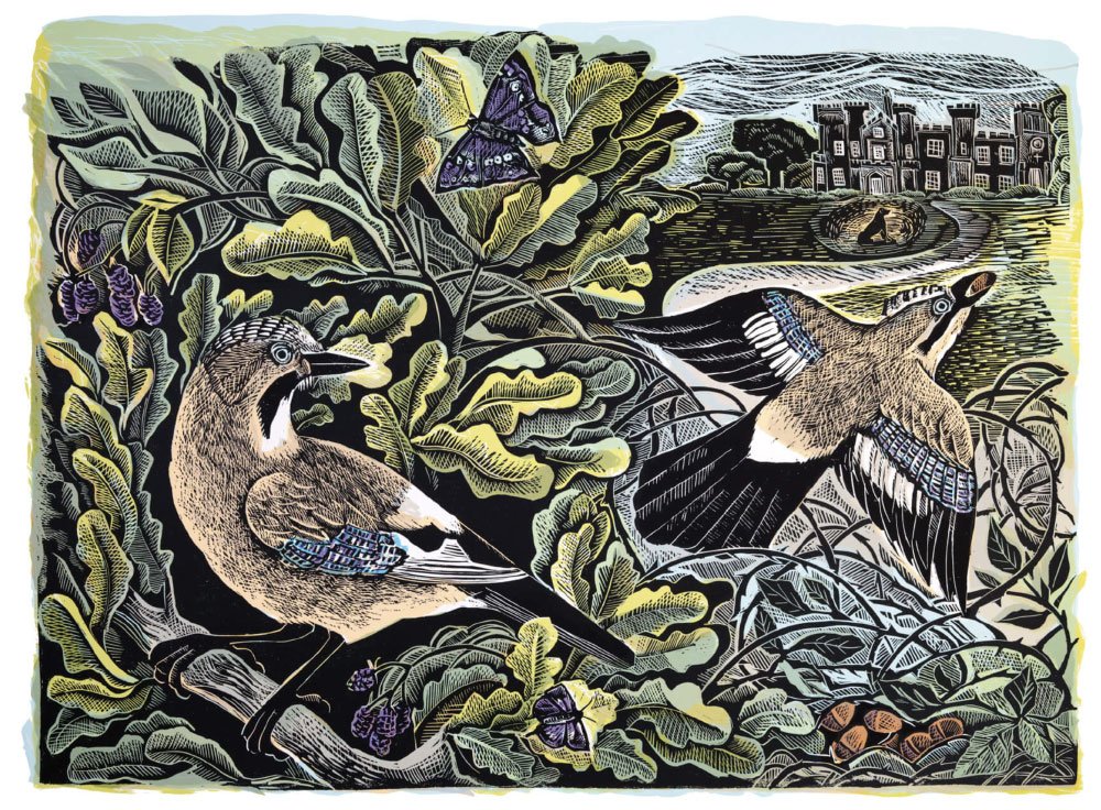
A Printmaker’s View, with Angela Harding
7–8:30pm, Thursday 15 February
In-person at St Bride Foundation, and online via Zoom
British wildlife has always inspired artist Angela Harding. She usually makes her work in a studio at the bottom of her garden which overlooks sheep fields surrounded by gentle sloping hills, spends summers with her husband on a small wooden sailboat exploring the Norfolk and Suffolk coasts and widely travels different corners of the UK from the Fair Isle to Cornwall.
Angela always carries a sketchbook on these trips – drawing on the landscape and wildlife that surrounds her. Back in the studio she uses a combination of drawing and imagination to create the iconic linocuts and illustrations that we all know and love.
Join us at the St Bride Foundation for an evening inspired by art, nature and an appreciation of the world around us to discover insights into the work and process of this remarkable artist.
Angela Harding is an author, printmaker and illustrator who lives in the village of Wing, Rutland. She is the author and illustrator of A Year Unfolding: A Printmaker’s View and Wild Light: A Printmaker’s Day and Night. Angela has also created the covers for many bestselling books, including The Salt Path and The Wild Silence by Raynor Winn, October, October by Katya Balen (winner of the Yoto Carnegie Medal 2022) among many others. Most recently she has collaborated with award-winning author and journalist Isabella Tree on Wilding: How to bring wildlife back – an illustrated guide.
Copies of Wilding: How to bring wildlife back – an illustrated guide will be available to purchase for anyone attending the lecture in-person. Find out more here.
Tickets
Always Now: Typography and Semiotics
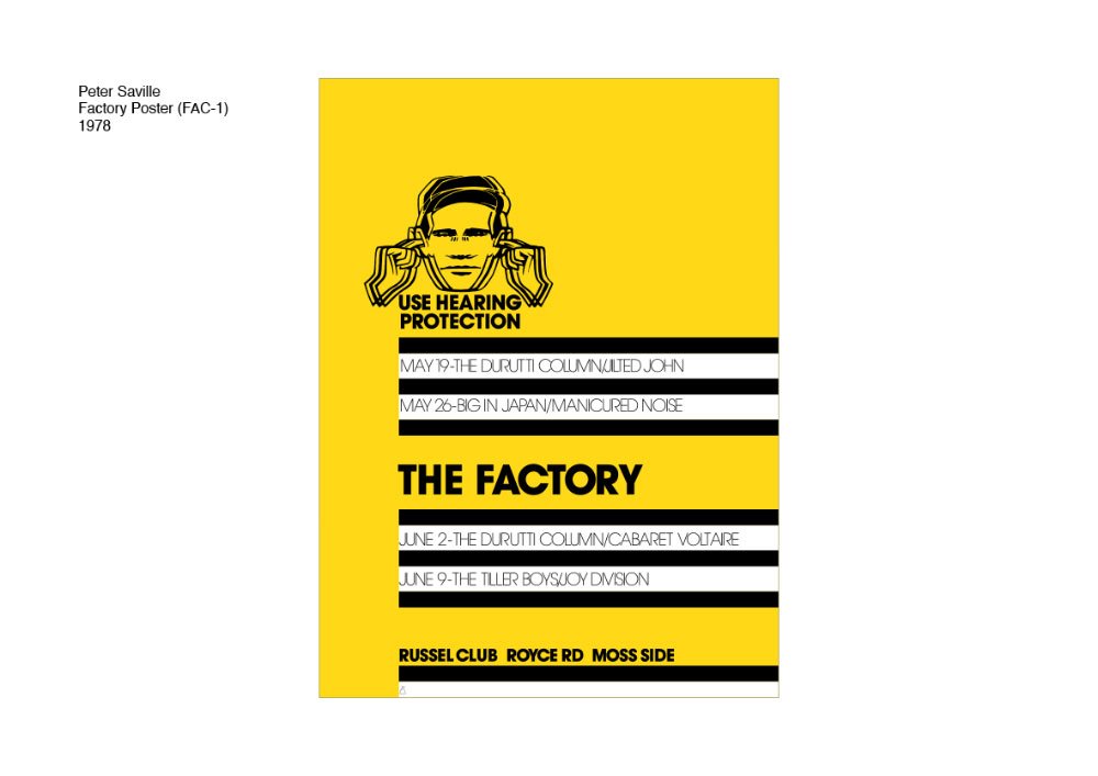
Peter Saville in conversation with Paul Barnes
7–8:30pm, Thursday 14 March 2024
In-person at St Bride Foundation and online via Zoom
Throughout his career, Peter Saville has consistently put type to work, often in conjunction with imagery, to elegantly sign the ‘way' for many of us. In conversation with his friend and typographic consultant, Paul Barnes, Saville will discuss how his work, from his time as Co-founder and Art Director of legendary UK label Factory Records through to a more recent collaboration with Sir Jonathan Ive’s studio LoveFrom, has been informed by an intuitive understanding of the semiotic power typography has to shape contemporary culture.
Peter Saville (b.1955, Manchester, England). As co-founder and art director of the independent UK record label Factory Peter Saville created some of the most iconic record covers of all time, best exemplified by those he designed for Joy Division and New Order between 1979–1993. His radical approach seemed to break all the rules, sometimes omitting information about artists or titles, or employing visual codes, fundamentally questioning modes of consumption and communication.
Going on to work extensively in fashion and the cultural sector, his achievements were celebrated in ‘The Peter Saville Show’ at the Design Museum London, 2003. His first major show in a contemporary art museum was at the Migros Museum in Zurich, 2005 and he continues to exhibit internationally. His first monograph was published by Frieze, 2003. Saville is a Royal Designer for Industry (RDI) and won the London Design Medal in 2013. In 2020 he received the CBE in recognition of the positive impact of his work over the past 40 years.
Paul Barnes (b. 1970) is a graphic designer specializing in the fields of lettering, typography, type design and publication design. He is partner with Christian Schwartz at Commercial Type, a type foundry based in London and New York.
Tickets
Shirley Hughes and Friends
With Clara Vuilliamy
7–8:30pm, Wednesday 20 March 2024
In-person at St Bride Foundation and online via Zoom
Drawing upon a huge archive of artwork, much of it rarely seen, Shirley Hughes’s daughter Clara will present a celebration of a long and remarkable career. From student days and early work in the 1950s and ’60s, dummy roughs and holiday sketchbooks, through to her most familiar picture-book characters, this is a unique opportunity to discover more about one of the best loved author-illustrators of all time.
Clara Vulliamy was born in London in 1962. She studied Fine Art at Chelsea School of Art, The Ruskin in Oxford and The Royal Academy, and initially pursued a career as a portrait painter and illustrator for newspapers and magazines. Clara began to concentrate on writing and illustrating children’s books when she had children of her own, and has published numerous titles including Dotty Detective, Marshmallow Pie and The Dog Squad. In 2014 she collaborated with her mum to create the young fiction series, Dixie O’Day.
Reading Type Specimens:
From Cicero to Spoonie Highdiddel Ladies’ Cicerone
With Paul Shaw
7–8:30pm, Wednesday 20 March 2024
In-person at St Bride Foundation and online via Zoom
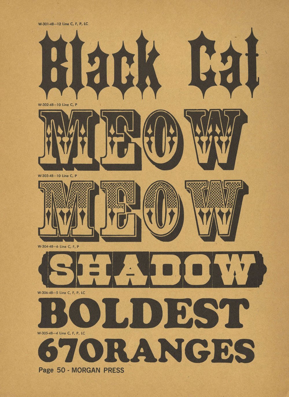
Most designers—and before them, printers—have looked at type specimen books. They have looked at typefaces to see how beautiful (or ugly) their letters are. And they have looked at typefaces set in a mass to see how legible they are. But they have not read type specimen books. They have not read the words, phrases, and paragraphs. This talk will closely examine the texts that typefounders used to display and promote their typefaces. Those texts have varied greatly, both over time and from typefounder to typefounder. Eighteenth-century typefounders, following the examples of William Caslon, relied on Cicero's First Speech against Catiline to show off their text types. Even when Fat Faces, Egyptians, and Grotesques emerged as display types in the early 1800s, they continued to use “Quousque tandem abutere”. But as the nineteenth century wore on, typefounders began to include quotations from literary and historical works, proverbs and maxims, patriotic references, verbal hijinks and humorous wordplay, and just plain random combinations of words.
Investigating these texts can help to accurately date specimens and typefaces, identify connections among foundries, reveal the political sympathies of typefounders, and shed light on the social and economic circumstances of the times. There are other texts in type specimens beyond the texts that showcase the typefaces: introductions, price lists, advertisements for ink makers and others, and the typographic apparatus of headers, titles, captions, and credits.
Paul Shaw is a designer and design historian. He has taught calligraphy, typography, the history of graphic design, and the history of type in various New York area universities and art schools since 1980. He is the author of ‘Helvetica and the New York City Subway System and Revival Type’; the co-author of ‘Blackletter: Type and National Identity’; and the editor of ‘The Eternal Letter: Two Millennia of the Classical Roman Capital’. For the last three years he has been researching type specimens both online and at collections in New York, Chicago, and San Francisco.